Overview
ArtSkool is a social app that empowers visual artists to leverage social media to make real connections through their artwork.
By establishing feedback sessions for artists and providing an easy way to develop a consistent artistic brand identity, Artskool aims to create security and ease for artists to portray their work online.
My Role
UX Research
UX Design
UI Design
Branding
Art on social media: lost in constant content
More platforms, more choices, more hashtags
Problem
Visual artists often struggle to stand out in an oversaturated social media landscape, resulting in feelings of isolation and frustration.
Solution
Creating a “by artists, for artists” platform to connect visual artists for feedback while simplifying the process of sharing art content across other platforms.
Define Artistic Brand Identity
Artists can describe their work efficiently and effectively by selecting their style and subject matter.
ArtSkool allows artists to stay consistent with their branding across platforms by generating a brand archetype.
Seek Authentic Feedback
Visual artists seek community online and need help finding authentic feedback from other knowledgeable artists.
Providing a trusted platform specific to visual artists can fill this need, allowing for post-grad and otherwise isolated artists to gain helpful insight into their work and fulfill their needs for the artistic community.
Discovery
Connection
Artists create connections with others in their field and recognize the value of cultivating a positive reputation to advance their careers within their occupational communities.
-Public Perceptions of Artists in Communities: A Sign of Changing Times Jennifer Novak-Leonard, Rachel Skaggs
Social Media
Digital content has disrupted traditional compensation structures in fields like art, with digital platforms typically prioritizing consumers over artists, despite the benefits of greater accessibility to audiences.
-For Profit or Not, Artists Need Tech Designed for Artists by Adam Huttler
Branding
Artists are 3.6 times more likely to be self-employed than other workers (34 percent vs. 9 percent).
50% of artists polled report that one of their biggest challenges is marketing themselves.
- Creativity Connects: Trends and conditions affecting US Artists - Center for Cultural Innovation For National Endowment for the Arts
Interviews
I conducted five interviews with those who fit within the demographics of my user base- visual artists from 18-36 who currently post their work on social media.
“... behind that is the feeling that I’ve created something that other people will also appreciate.”
L. L. (participant #3)
“...when Instagram first started, you could get genuine followers from all over just by posting. That felt really rewarding.”
L.H. (participant #1)
Key Insights from Interviews
Artists value others’ appreciation for their work over making sales from their work.
Many social media platforms with various tools, such as hashtags and differing algorithms, make posting complex.
When artists’ social media posts get more engagement, they are motivated to continue to post more often.
Design
Sitemap
I wanted to get a big-picture understanding of the app hierarchy. I considered segmenting the app into main pages: home feed, profile, studio, and search. Initially, I planned to have a page focused on notifications. I made these choices based on familiar social media conventions.
When thinking through some of the secondary pages, I continued to refer back to my user stories and focus on my users' goals: to present their artwork in the best possible light and get quality feedback from other artists.
Determining Red Routes
I created a matrix to determine the most used functions for the app, who would use them, and how often.
I focused on red routes that would best inform my design decisions going forward, so I avoided red routes, such as checking notifications.
User Flows
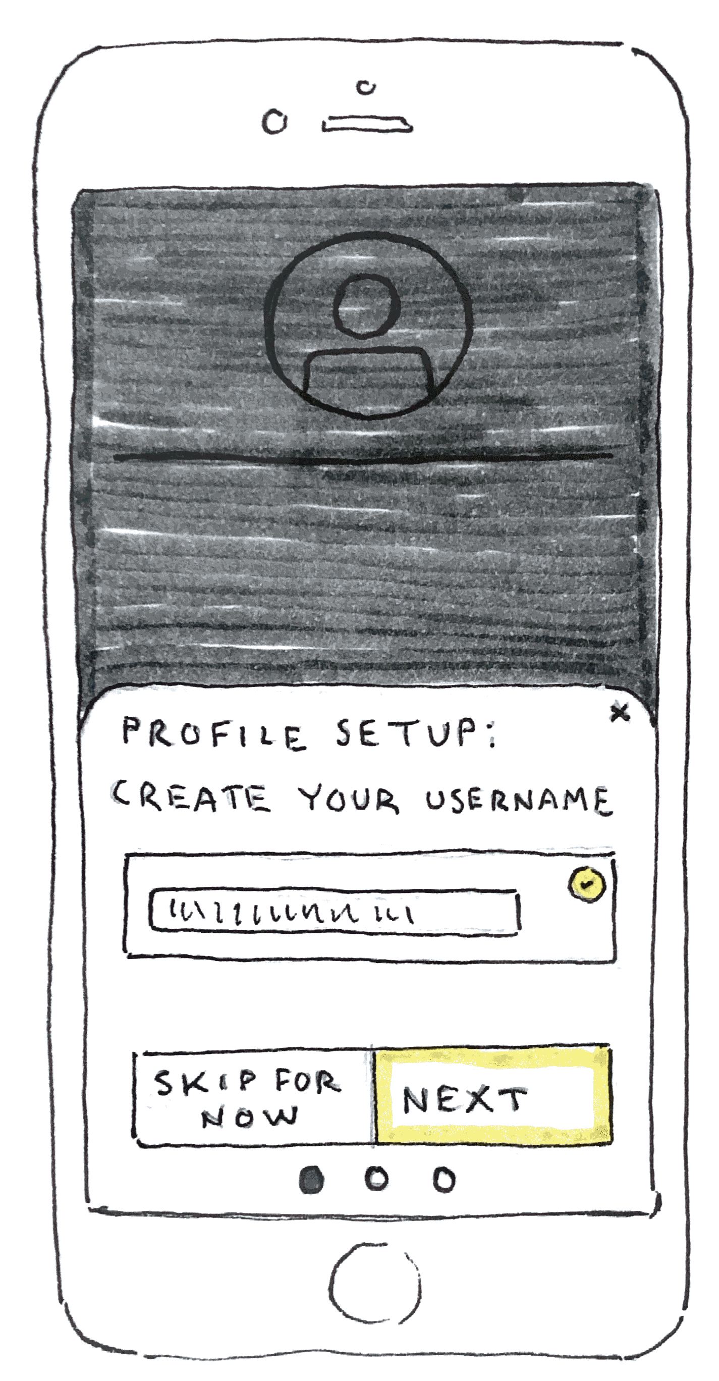
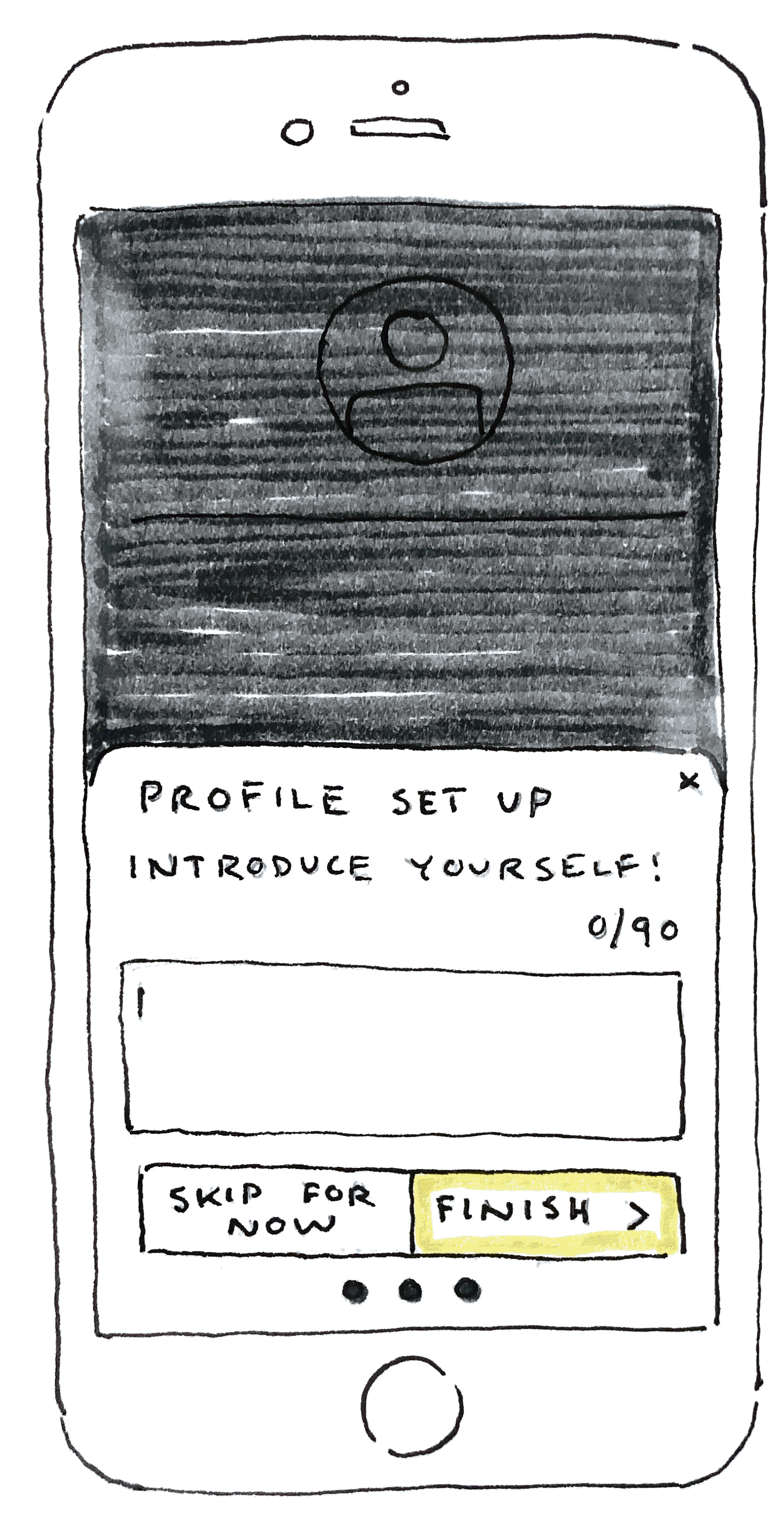
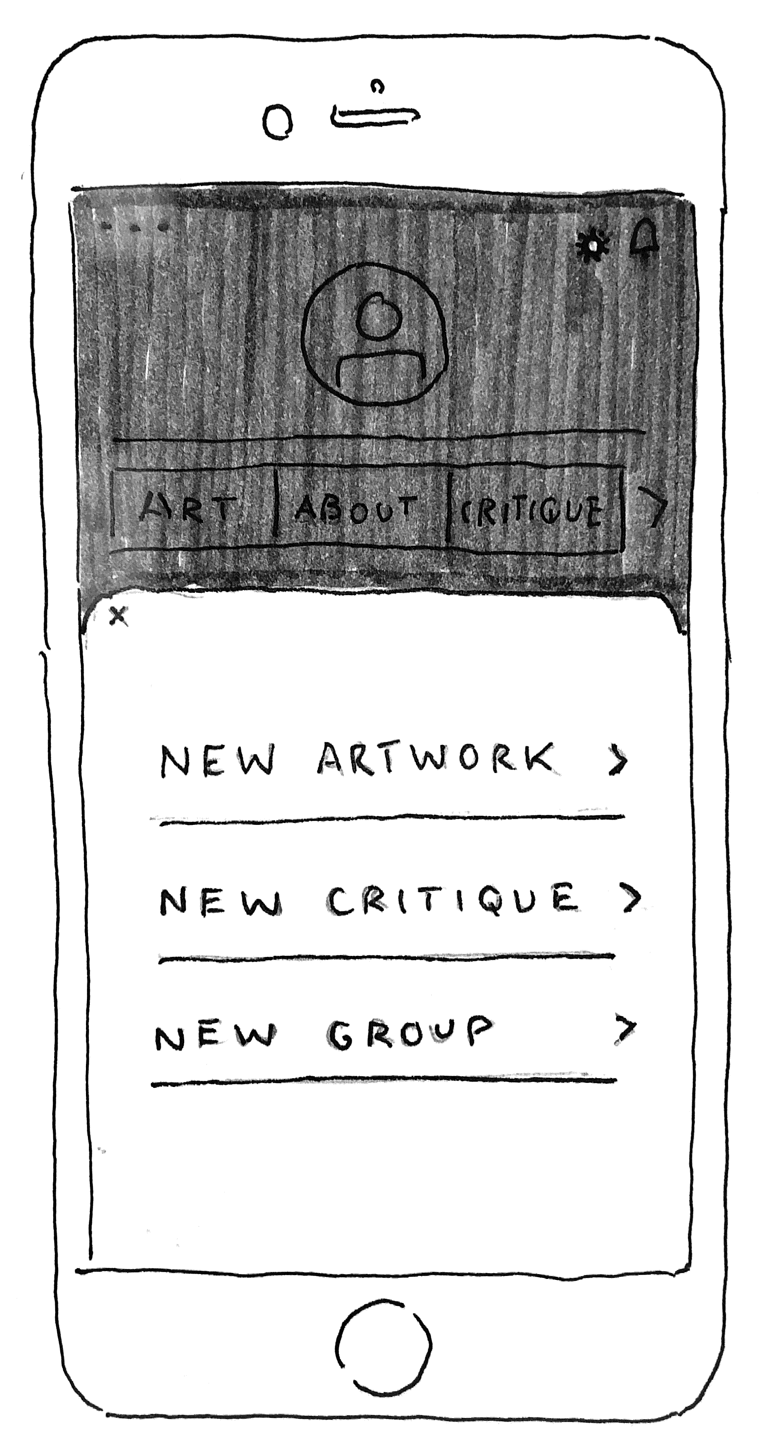
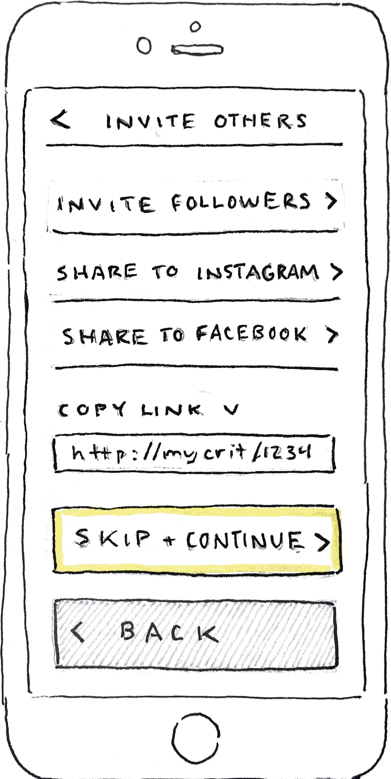
When creating my user flows, I focused on the high-level view of how the user would navigate the red routes.
I sought to make the flows vital to the MVP of the product, which would directly address my initial problem statements.
When sketching, I attempted to consider the app's navigation as much as possible to ensure user freedom and control, as efficiency is crucial to my user base.
In developing my sketches further, I could determine the general design of each red route and dive into the structure efficiently and cheaply, saving myself time in future stages of the design process.
After the second round of sketches, I implemented the sketches into a Marvel Pop prototype and conducted initial testing to determine the overall usability of my initial prototype.
Ideation




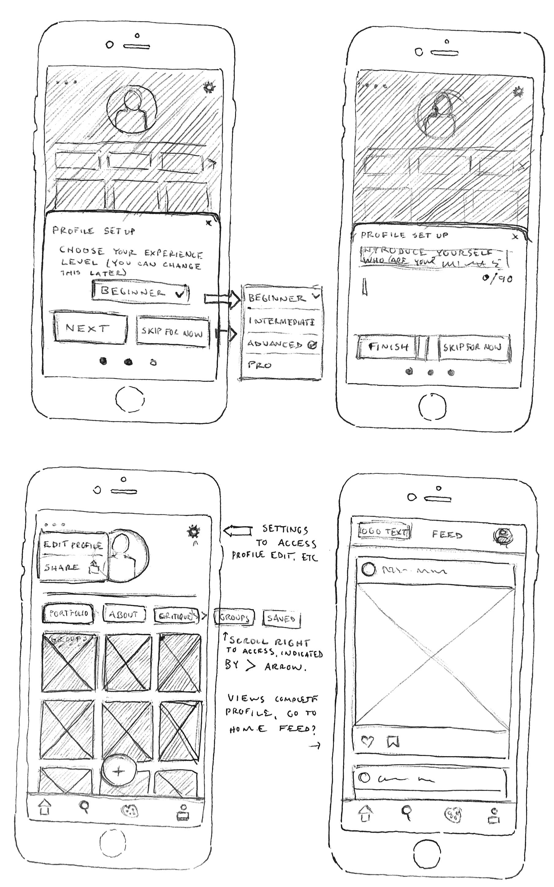
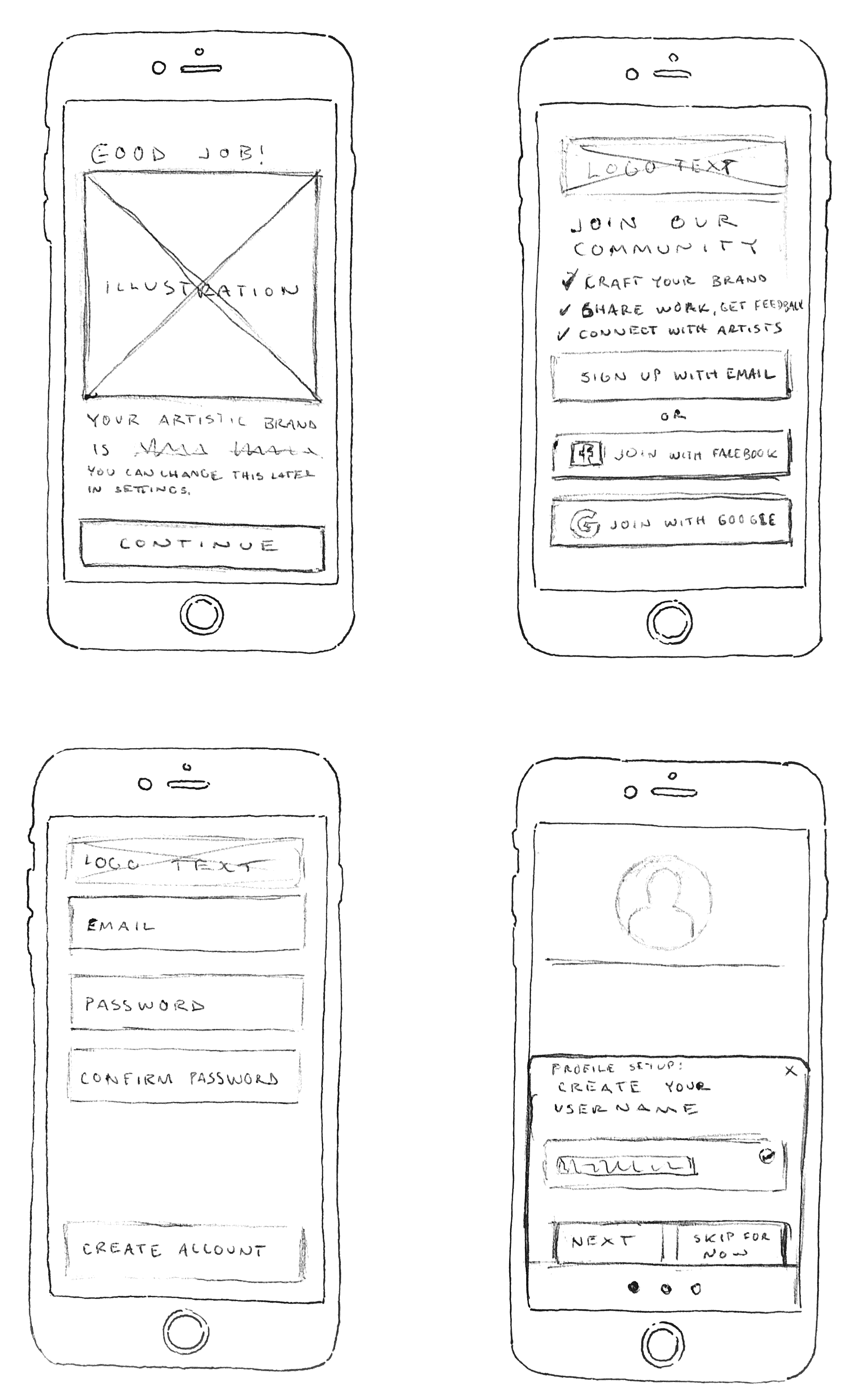

Onboarding Flow





Upload an Artwork Flow



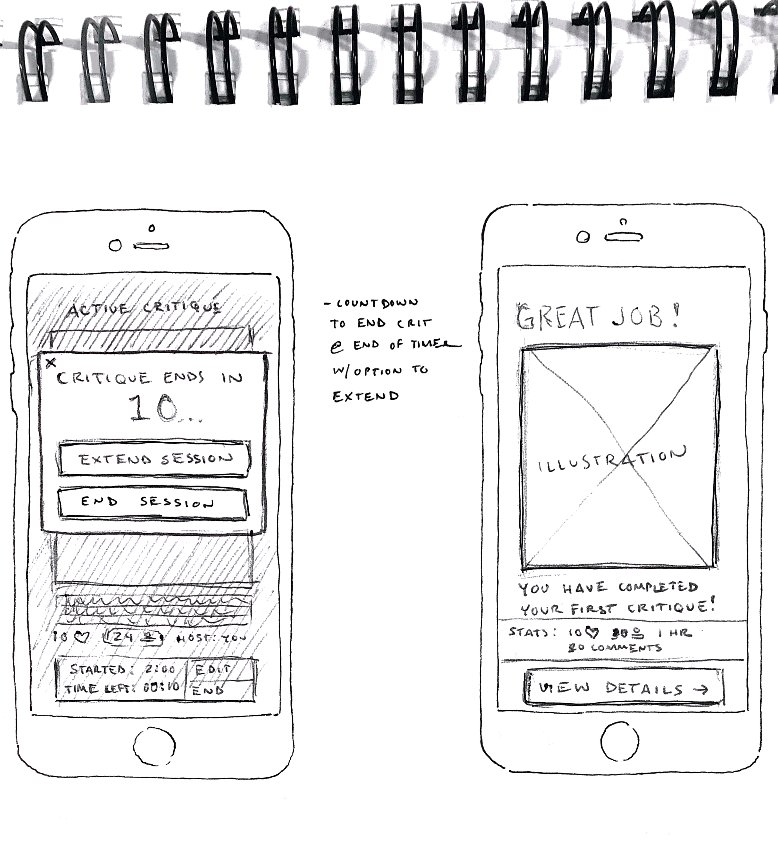
Start a New Critique Flow




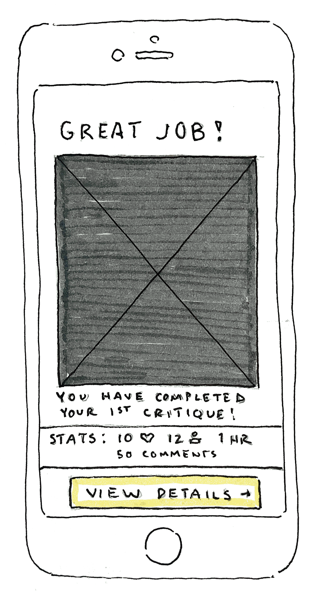


Guerilla Testing
Problem: Users are confused about where to access the critique function when navigating the Studio screen.
Solution: Condense the app's features to 3 main screens - home, profile, and search. Add the studio functions within the profile page. Finally, label the icons in the main navbar.
Problem: The users must feel comfortable and secure with the critique sessions.
Solution: Create a block function - tap the user profile picture in critique, modal asks to remove, block and remove, or cancel.
Wireframes
The sketches were on the right track, but the app's navigation needed to be easier to understand. In addition, I needed to clarify the iconography with labels.
Moving into the wireframe phase, I focused on the clarity with navigation by condensing the information architecture and implementing labels for icons.
Brand Identity
ArtSkool’s purpose focuses on the idea of connection, identity, and constant learning and growth. We aim to help artists feel confident and inspired to create.
UI and Imagery Inspiration
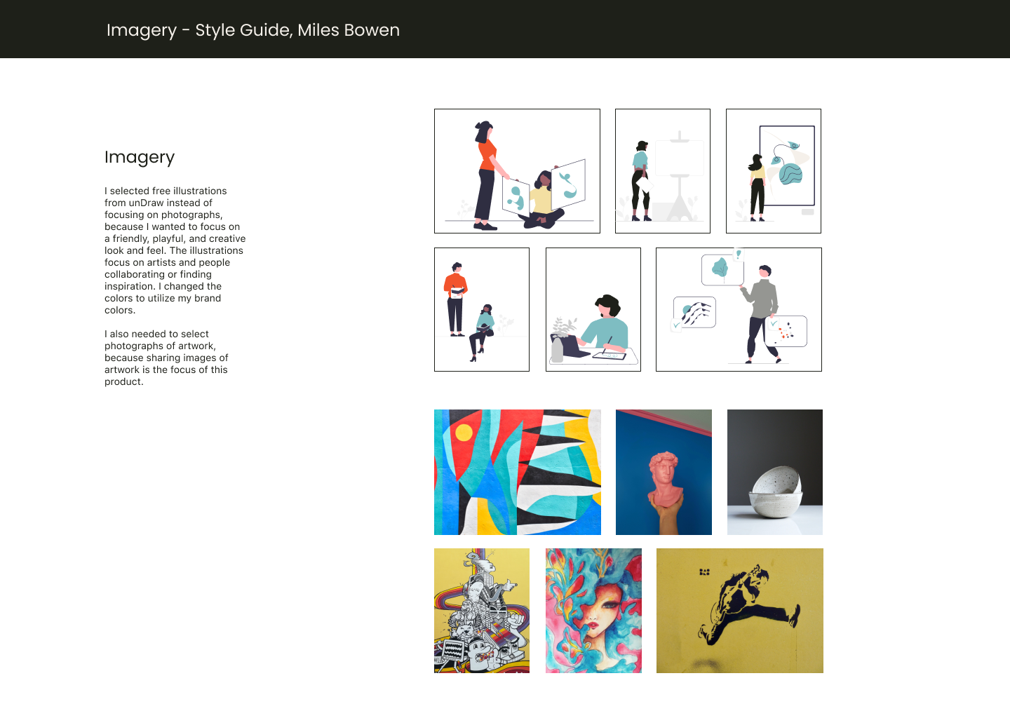
Simple and clean design will evoke a sense of trust and ease, while rounded and soft text and shapes create an approachable feeling. In addition, the design shows a feeling of youth and fun through contrast, color, and imagery.
Style Guide
The style guide underwent a few iterations to ensure accessibility and a clean, contemporary style.
I chose rounded shapes to create a softer, more friendly, and fun design when designing the buttons and input fields. Then, through iterating, I decided on icons that best-fit user expectations for social media icons.



Testing
Round One
Users were unsure how to set up a critique to get feedback on their artwork. The average participant took two attempts to locate and start a critique session.
3/5 participants attempted to tap the artwork to access the critique for that work and did not initially think to tap the plus icon as a way to start a new critique.
Solution: Create a page specific to the critique function accessible from the main navigation bar and the ‘plus’ icon.
Critique functions and details, primarily the action to remove or block a user from a critique, could have been more straightforward.
Solution: Change where users can access the “Remove/Block” function to align with social media conventions. Initially, users had to tap on a user’s profile image to remove or block them from the critique.
The onboarding flow and aesthetic details needed to meet user expectations.
Solution: Upgrade the overall aesthetic to more modern and clean by lightening the background color and gradient.
Round Two
After implementing the necessary changes from the first round of testing, I conducted another round of tests in the same way- 30-minute virtual sessions through Zoom.
Recommendations:
Three participants mentioned that it needed to be clarified how the app developed the suggested tags. They were also unsure of what the filters meant and how to adjust them.
One participant wondered how they could save hashtags for their work in the future when they noticed the “Saved Tags'' function. To remedy this, creating a pop-up that would notify users of how to use this function upon first use may be beneficial.
Two other participants mentioned the auto-generated filter based on brand identity. They suggested that applying the filter only when the user begins to edit the image may be best. One participant also suggested that the filter not be used by default but instead allow the user the option to select it when editing.
Future Considerations
Artist Verification
As part of the sign-up process, artists would be able to verify their account with an external social media account, such as Instagram or TikTok. The verification status would make users feel more confident that they are interacting with other visual artists, not random trolls.
A tiered verification system could also benefit users, allowing “beginner,” “intermediate,” and “expert” artists to feel confident about the knowledge level of those who are providing them feedback.
Additional Resources to aid with editing and posting video content.
TikTok has become a hugely popular social media platform, and artists use it to showcase their processes and even create tutorial videos to share with others. Therefore, partnering with a formidable social media platform would increase the user base. Users of ArtSkool would benefit from having an efficient way to edit and share their video content to fit their established brand identity.
Recommendations + Key Takeaways
Allow a way for users to exit the critique and navigate to other parts of the app but keep the critique session active. This function would allow maximum user control and freedom within one of the app's primary functions.
A UX writing recommendation: the word “critique” may sound too harsh for some users, although it will be a word familiar to my user base. Consider making the change to something friendlier such as “Feedback.”
Within the image editing portion of the artwork upload flow, users should only be notified about the auto-generated filters when editing the photo. The auto-generated filter should only be applied when users select a filter option, and the users should be informed by a pop-up message that they can adjust the filter and save preferences.
Always keep the research at the forefront of decisions throughout the design process. Remember to refer to specific aspects of research and leverage them when defending design decisions.
Confidence in design decisions is critical- clarify why I make a design decision and communicate this concisely to stakeholders. As I progress as a designer, confidence and concise communication are skills I will work to improve continually.
Iteration is a necessary part of the design process, but as a designer, I have to keep in mind the constraints of the project to stick clearly to the project's scope, especially regarding time.


